Monday, 20 June 2011
Evaluation
I think that my work could be alot better with the character design along with tokens as they are so simple. The only reason they are so simple is due to the deadline. Although I do like all the photography that has been done, I am going to make more time for my work in future. I think the ideas I had were brilliant but again, I didn't have enough time to sort this out again. Apart from the deadline, I think I have managed to put this well enough together. Alot of what I have used has been Photoshop, with masks and darkening the characters due to them being hand sketched, I didn't manage to make them dark enough with the pencil so I had to darken them in Photoshop Overall I think I can do better.
Road Signs

Road signs use alot of methods such as an automatic registering danger sign which are red which stick out more, this is used so it is easy to see and recognize. The stop sign is special, it has its very own shape which helps recognition when covered in snow. All signs with words are in big block capitals which help stand out more. This is used on every sign with writing on them.
Token Screenshots
Now I have added the tokens into the screen shots. Here are the screenshots.
1. Normal Screenshot with tokens.
2. Different angle with tokens.
3. Winning the level and getting awarded a token.


1. Normal Screenshot with tokens.
2. Different angle with tokens.
3. Winning the level and getting awarded a token.


Tokens
I have made five tokens for the game, here they are, all in their glory.
1. 5 points
2. -5 points
3. Unlock special stuff
4. Health
5. 10 points


1. 5 points
2. -5 points
3. Unlock special stuff
4. Health
5. 10 points


ScreenShots
I have made screenshots for the games that we have been making, here are some of them.
1. Here is my character walking across the wooden planks on a stage.
2. Here is a different camera angle of my character during gameplay.
3. Here is my character after winning.


1. Here is my character walking across the wooden planks on a stage.
2. Here is a different camera angle of my character during gameplay.
3. Here is my character after winning.


Character Design
I have done my character for the game, I thought since i am no good at hand drawing that I keep the design simple. Anyway here are three images that I have done. It is simple and appealing for kids which helps alot.
1. This is a profile view of the character.
2. Here is an action of the character walking.
3. And finally this is a front view of the character.


1. This is a profile view of the character.
2. Here is an action of the character walking.
3. And finally this is a front view of the character.


Monday, 6 June 2011
Insect, Animal, Plant
Next task was to draw three close up details of an Insect, an Animal and a Plant.
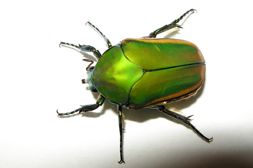
Emerald Scarab. I find these colours fascinating and the shell is just brilliant, I love the look of these insects.
http://farm3.static.flickr.com/2608/3860733047_792908129e.jpg


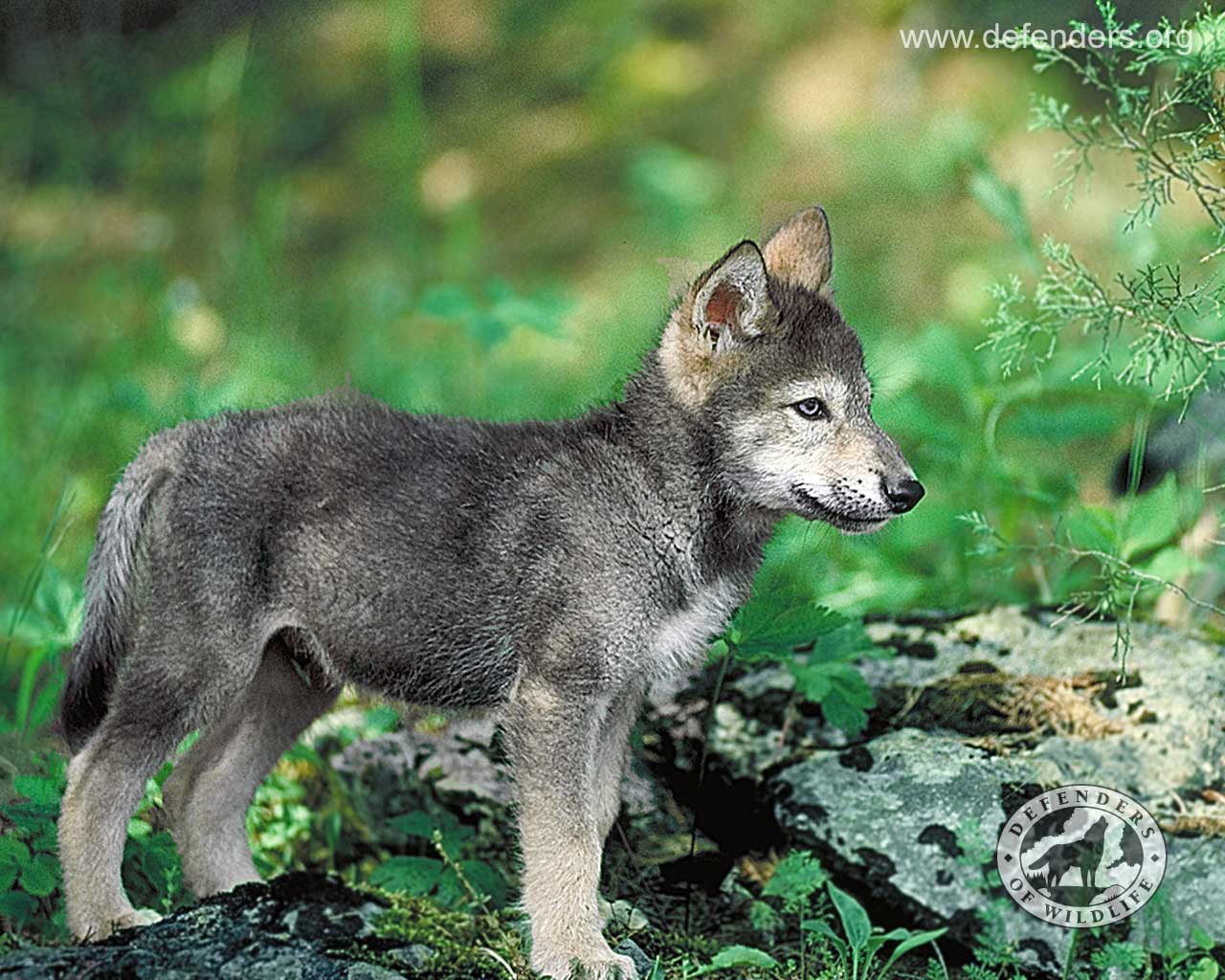
Wolf. I have always loved wolves and this is a perfect chance to draw one, the fur, the eyes are just brilliant.
http://howlingforjustice.files.wordpress.com/2010/06/wolf-pup-defenders.jpg


Venus Fly Trap: I am not a plant fan but these are just brilliant and unique.
http://www.toyday.co.uk/shop/images/uploads/venus-fly-trap.jpg


Emerald Scarab. I find these colours fascinating and the shell is just brilliant, I love the look of these insects.
http://farm3.static.flickr.com/2608/3860733047_792908129e.jpg


Wolf. I have always loved wolves and this is a perfect chance to draw one, the fur, the eyes are just brilliant.
http://howlingforjustice.files.wordpress.com/2010/06/wolf-pup-defenders.jpg


Venus Fly Trap: I am not a plant fan but these are just brilliant and unique.
http://www.toyday.co.uk/shop/images/uploads/venus-fly-trap.jpg


Imitating styles done by artists
Another task that had to be done is to research and do five imitations of an artists work. I have done all of mine based on Wassily Kandinsky.


Kandinsky analysed, in his writings, the geometrical elements which compose every painting, namely the point and the line, as well as the physical support and the material surface on which the artist draws or paints and which he called the basic plane or BP. He didn’t analyze them on an objective, exterior point of view, but on the point of view of their inner effect on the living subjectivity of the observer who looks at them and lets them act on his sensibility.
The point is, in practice, a small stain of colour put by the artist on the canvas. So the point used by the painter is not a geometric point, it is not a mathematical abstraction, it possesses a certain extension, a form and a colour. This form can be a square, a triangle, a circle, like a star or even more complex. The point is the most concise form, but according to its placement on the basic plane it will take a different tonality. It can be isolated or put in resonance with other points or lines.
The line is the product of a force. It is a point on which a living force has been applied in a given direction, the force applied on the pencil or on the paint brush by the hand of the artist. The produced linear forms can be of several types: a straight line, which results from a unique force applied in a single direction, an angular line, which results from the alternation of two forces with different directions, or a curved or wave-like line produced by the effect of two forces acting simultaneously. A plane can be obtained by condensation, from a line rotated around one of its ends.
The subjective effect produced by a line depends on its orientation: the horizontal line corresponds to the ground, on which man rests and moves; it possesses a dark and cold affective tonality similar with black or blue. The vertical line corresponds to height which offers no support; it possesses a luminous and warm tonality close to white and yellow. A diagonal possesses by consequence a more or less warm or cold tonality according to its inclination according to the horizontal and to the vertical.
A force which deploys itself without obstacle as the one which produces a straight line corresponds to lyricism, while several forces which confront or annoy each other form a drama. The angle formed by the angular line possesses as well an inner sonority which is warm and close to yellow for an acute angle (triangle), cold and similar to blue for an obtuse angle (circle) and similar to red for a right angle (square).
The basic plane is, in general, rectangular or square, thus it is composed of horizontal and vertical lines which delimit it and define it as an autonomous entity which serves as support to the painting, communicating its affective tonality. This tonality is determined by the relative importance of horizontal and vertical lines, the horizontals giving a calm and cold tonality to the basic plane, while the verticals give it a calm and warm tonality. The artist possesses the intuition of this inner effect of the canvas format and dimensions, which he chooses according to the tonality he wants to give to his work. Kandinsky even considers the basic plane as a living being that the artist "fertilizes" and of which he feels the "breathing".
Every part of the basic plane possesses a proper affective colouration which influences the tonality of the pictorial elements that will be drawn on it, and which contributes to the richness of the composition which results from their juxtaposition on the canvas. The above of the basic plane corresponds to the looseness and to lightness, while the below evokes the condensation and heaviness. The work of the painter is to listen and to know these effects in order to produce paintings which are not just the effect of a random process, but the fruit of an authentic work and the result of an effort towards the inner beauty.
And finally here are the scans of what I have done similar to Kandinsky.


Line drawings of a toy
One of the tasks that I have had to do is do a line drawing of one toy in three different angles. I don't have any toys so I based it off a google image toy with three different angles. I used a Yoshi figure for this.

Then I have to shade one in and colour another one in. Here is my finished results.
[image inserted here when scanned]

Then I have to shade one in and colour another one in. Here is my finished results.
[image inserted here when scanned]
Dartmoor photos for game


2. Here again I think will be good as another obstacle which can be used for cover from special moves.
3. Now this image can be used as a background (minus Ed).

4. This image I can turn into an actual stage itself, it has a ledge, obstacles and even a nice background.

5. I am thinking about making different kind of camera angles and one like this peering through a wall looks like a good idea.

6. This could possibly be another angle but just a more close up version.

7. Here is another idea for another stage, I think it is a nice flat land which has plenty of space to add more stuff like obstacles.

8. Again another idea for a stage with a background, even got a sheep in it.

9. Now this looks like a great idea for a background. This will fit really well on a steep stage.

10. If you land a good hit to finish off your opponent into the air, this will be how you see them fly up in the air.

11. Here maybe I could style a stage on top of trees that have really strong branches.

12. Now this looks like a perfect background. Would look great behind the trees.

13. Another possible camera angle.

14. A rock which can be kicked at your opponent.

15. Another possible obstacle which will have to jump up to on the right side.

16. The ground will be a good base for a stage.

17. Here if this sign is found, the player wins extra tokens.

18. Now this tree can be used in the centre of the stage but as a background which can be used to climb.

19. Here can be used as an 'out the woodland' stage which the water will rise and fall over time, which can slow you down.

20. When the water rises, random bits of wood can be seen floating by in the background.
Line Drawing

(All images I have found are from google images)
Here is one of the line drawings I have found. This one caught my eye and I think it was drawn really well, mostly using straight lines. I really cannot see any curved lines as each line is connected to each other, even though it may just be straight lines, it captures the image of a boat perfectly.

Next is this image I have found. This time it only uses curved lines instead of straight lines. Each angle of the curved lines have been curved perfectly. This image seems to catch your mind more than a picture which I think it does really well. It kind of makes me feel like I am swaying on the spot.

This time I have found a nice basic line drawing of a mouse. This may be basic but it is done really well. Again though this is all curved lines which as you can tell with the eyes, have been repeated over and over again until it fill every spot of the eye. This image has a nice warm feeling about it.

Next is an image of a Gold Fish. Here is the first combination of straight and curved lines that I have come across so far. The scales are so detailed, the fins, the tail, the face, all of it. I can easily say this has been perfectly drawn with every bit of detail.

Now this image is another mix of straight and curved lines.Although it doesn't catch the true shape of a cats head, the rest is drawn up to scale. Again with the eyes, they have been curved repeatedly until the eye is formed properly. The whiskers are also a simple swish.
Subscribe to:
Comments (Atom)